00:00
00:00
Nacale
ugh

Age 35, Male

Wasting time

Joined on 11/4/07

Level:
10
Exp Points:
950 / 1,110
Exp Rank:
71,878
Vote Power:
5.20 votes
Rank:
Town Watch
Global Rank:
44,671
Blams:
48
Saves:
151
B/P Bonus:
2%
Whistle:
Normal
Medals:
239

First GIMP pic! @_@

Posted by Nacale - March 18th, 2009


.
/* */

.
/* */
This is my first real GIMP picture...and I sorta don't like it. I know why it's so suckish though, cause it is like my first one made from GIMP. I guess I just gotta practice more. I'm not too happy with it. T-T

Edit: I just added somewhat of a background to the picture.....it's ugly but better than it being blank.
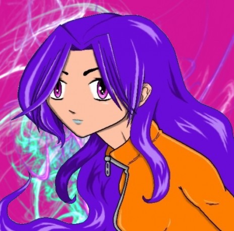
First GIMP pic! @_@


Comments

its cool

Thanx!.........Your cool......I think. @_@

Hm; it might help if I knew what "GIMP" stood for, because at this point in time, I've got the mental image that you are using a crippled child to draw on your computer; and although it is quite funny to think about, it is probably an incorrect assumption.

Leaving that aside, I do like the picture. At any rate, I probably couldn't draw it. By that I mean I lack any form of attention span to try to draw anything good before my mind wanders off and hey: There's 80 doodles of camels RIGHT ON TOP of my intricate sketch.

If I had any suggestions, they would be these:
1: The orange jump-suit is a little bland. Perhaps add a stripe or two, 'cuz a lone orange makes it look like the character might be an ex-convict. OR IS SHE?!
2: The swirl of hair [bottom left corner] seems a bit confusing, not to mention breaking the laws of Physics. I know you were probably just trying to make less "blankness" on the page, but gravity defying spring hair isn't the best way to do it. Perhaps add a big squiggly signature to use as filler, along with solidifying the fact that you, in fact, made said picture. But hey; who am I to question an ex-con purple-haired/eyed blue-lipped femme fatale?

I just realized, in retrospect, that I sort of contradicted myself in a way. "If I had any suggestions, they would be these." That's almost as confusing as saying "Everything I say is a lie. OR IS IT?!"

I do have mentally crppled chidren on the computer....daily, my brothers.

I can't finsh a whole picture in one setting either, it takes days or sometimes a week or two to finish a picture......if in fact I do get around to finishing it.

1.The orange "jacket" does need more in fact I thought of putting strips along the arms too. She also could be an ex-convict, sounds awesome.
2.It's not springy hair, it's like that to help give the picture movement. Hair, in any aspect of art, always helps emphasize movement of the person or wind and sometimes in some situations hair can also help show the emotion of an character. You are right though, I could have put my sig on it or something.

Would you, in fact, lie to me @_@

Geez, this is awesome! 8D I really like it, my only problem is that it needs a background. But I think its cool, I like the colors, and the shading is EPIC. Its lots better than why I tried to use Gimp. 83

Thanx!!! @_@
I know! The only thing is I hate doing backgrouds. I'm no good at all in that department. Besides, I wouldn't know how to put one on using the computer, I never tried to.

I can't see why you don't like it. It's awesome.

Maybe it's cause I'm the only one who sees which parts I had problems with, and still don't veiw them as perfect. Yeah! Thats it, sounds believeable right? Thats my story and I'm sticking to it! @_@

The only problem I see is the mouth. :|

You don't like her blue lipstick? @_@

Hey I love it! Of course, I just look at my post and saw your coment so everything I could say about this picture has already been said. Either way, I think it's great. I agree with the jaket needing more but beside that I think it's pretty ^.^

Aww thanx! @_@
I'm debating a bacground for it though...

Not bad it's a pretty good drawing although a stripe or two wouldn't hurt on the jacket.....

I know......I'm just too lazy to fix it. T-T

After reading the comments of the rest of the population... A racing stripe wouldn't be awful. ^^
However, the idea of her being a purple-haired escaped convict is really BAD ASS.
And I made all my backgrounds using photoshop, which sadly, isn't free... So sad. But I think you could do something similar with the lovely GIMP as well.

I'm just so lazy is all.
I love that idea so much I think I'll run with it! "Violet Convict" Yay, a name for it!
I've been trying to make a background for it but I cant figure out how to layer the pic of the girl onto the first/background layer. I'll just keep expiramenting with it though. ^_^

No, blue lipstick looks weird.

Thats why it's there! I love to think outside the box..... I haven't seen that shade of blue on a lip yet, so I went for it. :D

that doesn't look gimped.

Is that good or bad?......Either way thanx for contributing your thought. I shalt keep it in my opinion bank. Mommy said if I save up enough opinionies (play on pennies)
I could someday get that new brain I always wanted! ^_^

Don't ever point out your puns again. Please.

Was it not funny? I thought it was.

Huh. To layer it differently, there should be something called the "magnetic lasso tool", or named similarly. If there is such a function, you would right click the area you outlined, and click "layer from background", I think. ^^

Awesome! .......Sounds easy enough. Thanx! ^_^

Stuff like this gets easier with practice. I suggest that in the future you make the background transparent in the beginning, so you can add the background in a lower layer when you're done. ^^

...Thats sounds smart.........my idea now! *runs away with ingenious plan*

Well, today your post gave me some fun.

I came in and noticed you have a video on your page.
Here's essentially what I thought.
"Oh, looks kind of cut---OH GOD IT'S A JAPANESE OCTOPUS GIRL HEAD.
WHAT HATH GOD WROUGHT."

So, did you make said affront to God, or did oyu simply appreciate it's... Uh... Artistic qualities?

Oh, and doesn't that use the same artificial singing program as this?
<a href="http://www.youtube.com/watch?v=j7al5TKaR8M">http://www.youtube.com/watch?v=j7al5T KaR8M</a>
I think the program is called "Nendroid." At least, that's what the title says.

I have no clue what the program is called but it was soooo AWESOME!!! (cute) @_@

The second video seems familiar. :|

Hmmm...thats quite qweer. How could that be, the internet isn't a small place at all. Very small odds. @_@

I know! @_@
I was being super sarcastic. lol.

It's hard to know when people are being sarcastic on the internet. :D

Thats why I use lots of emotes! It helps people to know the tone of what I'm saying. You know like if I was happy or something I'd use a ^-^ emote (or ^_^).
Too bad theres not a sarcasm one.....-_-

BOREDOM STRIKES AGAIN!
...Yay?

So, I noticed you liked the other video using the "Nendroid" or "Vocaloid" system... Whatever they're called. Anyways, I got to wondering, "Where did these songs come from? Well, it turns out that both of these songs are RE-MAKES of other songs.

The original version of the first video is called "Kurutto Mawatte Ikkaiten," and is the ending theme to an anime series.
It can be found here.
<a href="http://www.youtube.com/watch?v=9Opvp6lavhU&feature=PlayList&p=06EB6817DE3AD5F4&playnext=1&playnext_from=PL&index=14">http://www.youtube.com/watch?v=9Opvp6 lavhU&feature=PlayList&p=06EB 6817DE3AD5F4&playnext=1&playn ext_from=PL&index=14</a>
[Not quite as cute, but close]

The other was still made using the Vocaloid system, but for a different video.
Here is the original [which, suprisingly enough, makes LESS sense than the "Octopus-Head girl."
<a href="http://www.youtube.com/watch?v=7U4qH9ysdpY&feature=related">http://www.youtube.com/watch?v=7U4qH9 ysdpY&feature=related</a>

I likes it when your bored.....you talk more that way. :D

I though it to be quite funny that the squid head girl's song was a remake of the bluish-green haired girl's show/video. Unless you meant it to be that way.

The "Kurutto Mawatte Ikkaiten" video was wierd as hell. What kind of ugly show is that? I hate it, not cute at all. humph. -_-

But I liked the one with all the vegtables! <3
It sorta looked like thats all it was about.......vegetable and fruit drink! Japanese V8! Ha! @_@

I like it when I'm bored... Too?

The fact that the "Tako Luka" [Tako meaning Octopus in Japanese] video ended up being a remix of a Vocaloid video is a mere happenstance, although I do see the easily made connection between the two.

The person with the blue hair [Upon further research, has found her name to be Hatsune Miku] is actually a "poster-child" for the Vocaloid program. In other words, it is a character that was created to give the program a recognizable face, sort of like how Nintendo uses Mario, how that pea company uses the Jolly Green giant, and so on. So; since the song is using that system, obviously it is going to have that character in it. The "Tako Luka" Video is doing a re-make of one of those songs; henceforth the connection.

I kinda thought the characters in the "Kurutto Mawatte Ikkaiten" video looked kinda like obscure Japanese turtles. Meh; just my opinion.

Why can't American commercials be like horrendous acid trips in grocery stores?

[Things you cannot un-see: Part 1: When the blue eyed farmer flies by near the end of the video, pause it. WHAT'S THAT IN HIS PANTS?]

Why I never put such determination into a school research paper, I will never know. I swear, if they made every paper about obscure Japanese crap, I would ace every paper ever.

Why would you like to be bored?

Whats this Volcaloid program anyway. That song....I wish it to be my theme song.

And yes, those things did in fact look like hideous disfigured cartoon turtles.

If we did have commercials like that I'm sure I'd never get up off the couch. for fear of missing one. -_-

OM(friggin)G! IT'S THE VEGETABLE/FRUIT JUICE! I can't believe I missed that....

I know why ....schools just aren't as interesting as Japanese Anime comercials!

Oh snap, VOCALOIDS. 8D

I didn't even know of that show till yesterday! T_T
I'm so late

More Results